Table of Contents
Introduction
This dataset is a spatial database of historical wildfires in the United States from 1992 to 2015. The dataset is generated to support the Fire Program Analysis (FPA) system. There are over 1.88 million wildfire records in this dataset.
Using this dataset, I aim explore the dataset and compare various predictive model to see how well we can predict the statistical causes of wildfires. This site specifically highlights the key summaries and findings thus it contains little to no code. If you want to see the code you can go onto the right or below and view the Kaggle Notebook or Code Notebook.
Kaggle Notebook Code Repository Data Source
Citation: Short, Karen C. 2017. Spatial wildfire occurrence data for the United States, 1992-2015 [FPAFOD20170508]. 4th Edition. Fort Collins, CO: Forest Service Research Data Archive. https://doi.org/10.2737/RDS-2013-0009.4
Notebook
You can download and run the notebook as it. Some of the required packages include plotly, json, pandas, sqlite3, scikit-learn, xgboost, random forests, and numpy. You get this notebook by selecting the github link on the right.
The notebook uses a combination of datasets to support the wildfire dataset. This includes a US County Mapping and FIPS to state mapping.
Findings
Initial Exploration
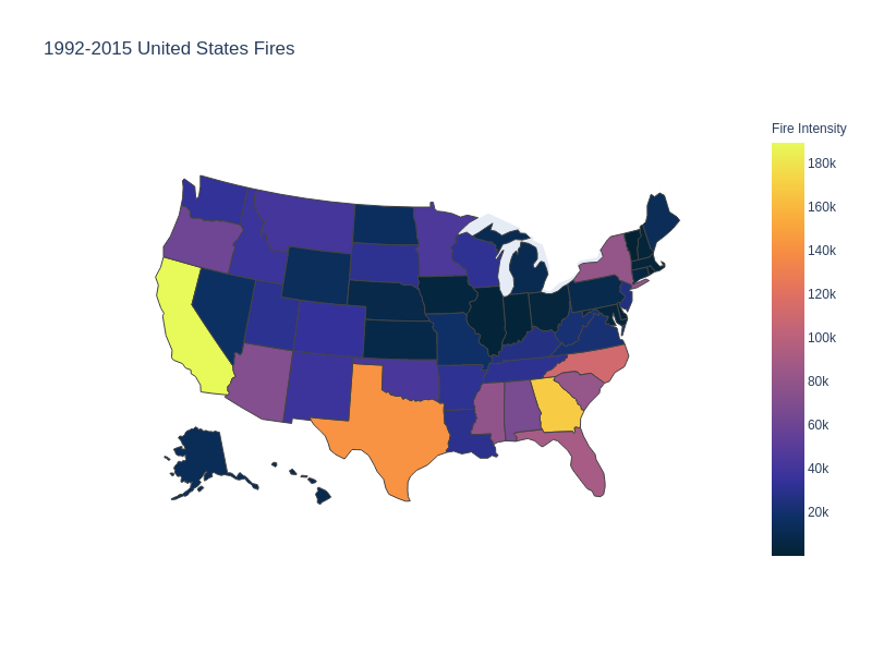
This choropleth looks at all the documented fires from 1992 - 2015. We can see that California saw the most fires during this timeframe of around 189,550 followed by Georgia (168,867) and Texas (142,021). These records were acquired from the FPA FOD which obtains data from the reporting systems of ferderal, state, and local organizations. Additionally this graph looks at the discovery year of the fire as well as which county the fire originated in based on fire report. The states with the least amount of reported fires are those that are close to black such as Vermont, Deleware and Rhode Island.
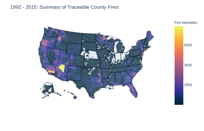
There is an abundant of counties without any traceable fires from 1992 - 2015. This is portrayed by the blanks in states like Nebraska, Indiana, and parts of Ohio, Illinois, Alaska, Lousiana and Oklahoma. Hotter regions include areas of Arizona, Southern California, Hawaii, and New York. This traceable data accounts for around 64% of the recorded wildfires in the United States from 1952 to 2015. We will investigate the origins of the reported fires in a later section.
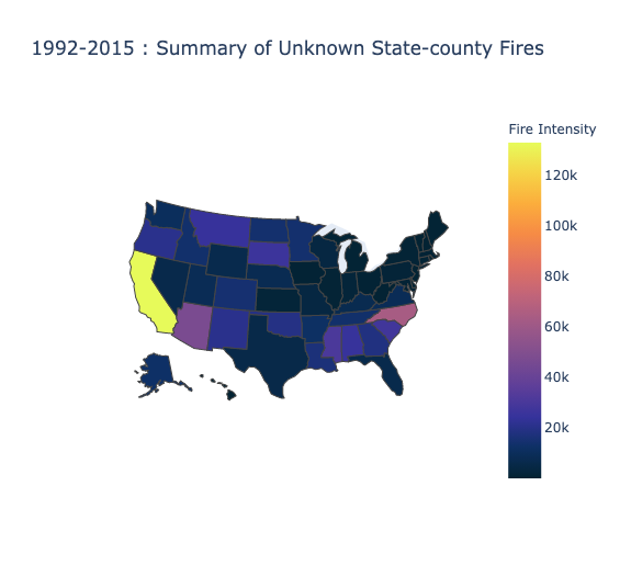 This choropleth accounts for the remainder (36%) of the recorded wildfires discovery in the United States. It specifically looks at wildfires where they could not identify the county that reported the fire or where it originated. Taking a closer look at the graph, there is still an abundance of fires in California followed by North Carolina. The regions with the least amount of fires are those in the North East of the United States such as Maine, Vermont, New Hampshire, New York, Pennsylvania.
In summary of this initial exploration, there are 1880465 total fires, 1202317 are known county fires and the other 67814 are unknown county fires. This is a 64 - 36 ratio of known - unknown county fires.
Time Progression of Known County Fires
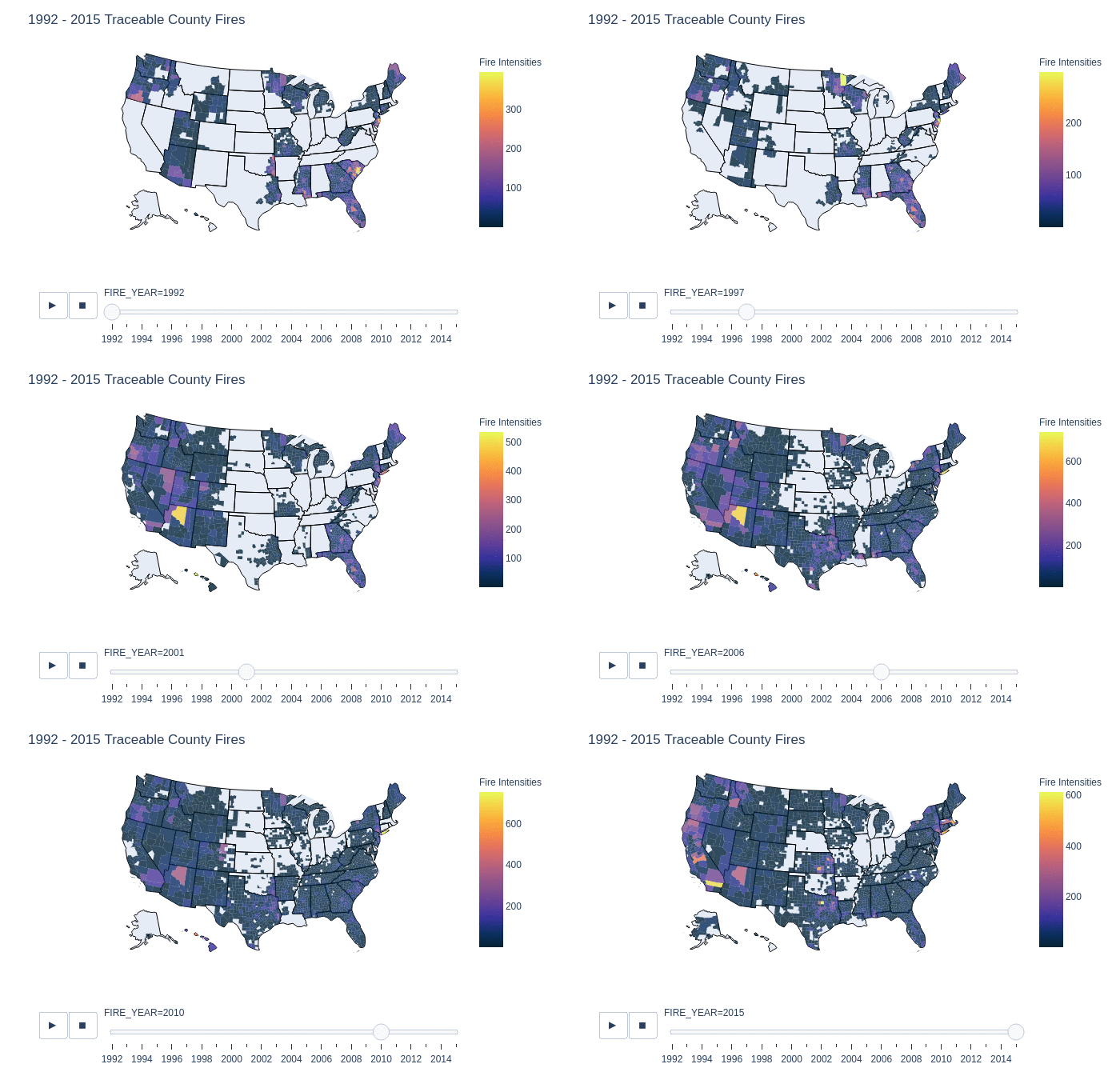
This is a slider animation to show in greater detail the fires with tracable origins. It displays the number of reported county fires from 1992 to 2015 by year, this is further broken down by state and then by counties for each year. Surprisingly in the early years there was not much in the way of data collection in wildfires in 1992. However as the years continues, we can see the growth of county reports from various organizations. It is important to note that we cannot conclude from this graph that there were no fires in the blank region x, in year y because the data is only of recorded and origin traced fires.
One interesting finding is that from 1998 - 2010, county 04005 in Arizona, has on average a lot of traceable fires in that area. Compared to other counties, this county is likely a large contributor to the number of traceable fires in Arizona. This is also shown in a previous graphic that summarizes the total number of traceable fires.
Statistical Causes of Fires
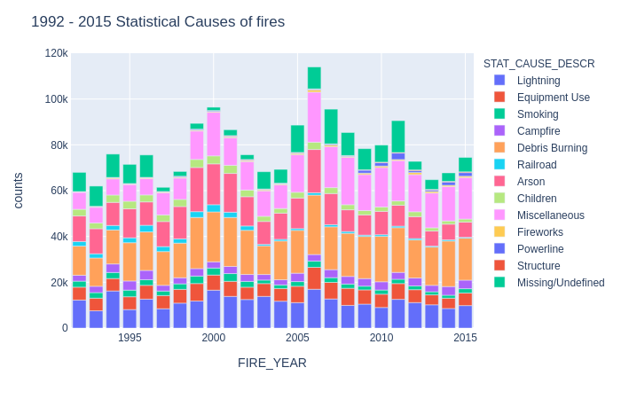
A very colorful chart however it is interesting to look up the makeup of reported fires causes by year. Each color scheme represents the statistical cause and their total stack represents the total number of reported fires with a statistical cause by year. We can observe that the number of fires seems like an upward trend where every few years, we can see a decline in fires followed by a sudden large increase of cases.
Taking another dive, let’s see how many acres were burned by year.
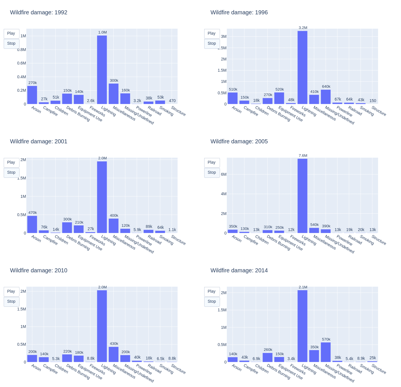
This animation visualizes how many acres were burned per year by each statistical cause. As the graph shifts, so does the number of acres burned by each fire. We can see that lightning is often the main contributor to the burning of acres. This is followed by miscellaneous, unidentifiable then arson causes.
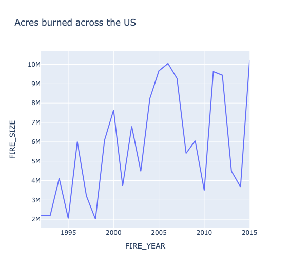
Taking a look into the total number of acres burned in the United States by year, there is an upward trend. Wildfires are known to release between 5 and 30 tonnes of carbon per hectare and referencing this graph we can see that there is definitely an increase in C02 emissions from wildfires in the United States.
Machine Learning Prediction
Can we use information from wildfire reports such as discovery_time, wildlandRole, unit_type, fire_size, fire_size_class, state, and county to predict what was the statistical cause of the fire?
In order to do this, we need to preprocess the dataset as such we merge the agency and fire dataset. We also need to extract the day of the week and month for each record to be included as a variable. This is done by converting the timestamp into a julian date. Lastly we need to convert all non-numerical values to a label encoding.
In this dataset I also try predicting the normal 13 statistcal causes and another case where it is 3 types of statistical causes. The reason why it is 3 is because I am grouping the statistical causes by their known cause type: Natural, Human, or other causes.
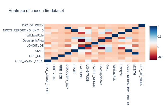
In this heatmap, I chose two distinct colors to make the differences more visible. The closer the color is to blue, the stronger the correlation whereas the closer it is to red, the weaker the correlation. What I find interesting in this correlation is that lattitude has a much weaker correlation to Geographic area than longitude.
– Disclaimer – I am color-blind but I based this insight by looking at the numbers provided by each correlation.
With the main preprocessing done, we apply it with various machine learning approaches. This includes Random Forests, XGBoost, Logistic Regression, and much more!

Based on the results of each model, Random Forests and XGBoost performing really well and Logistic Regression and SVM’s not so much. This is likely because for SVM and Logistic Regression the high dimensionality is making it unable to generalize well for a multinominal classification whereas for Random Forests and XGBoost it is easier to handle. Specifically SVM’s are not meant to handle multiclass classification but instead binary classification.
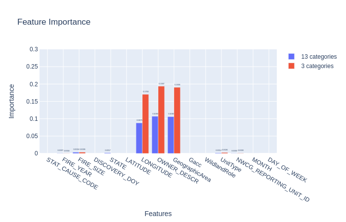
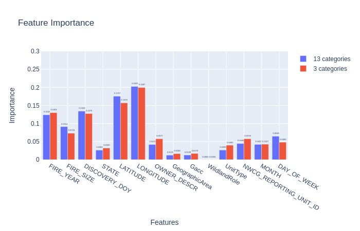
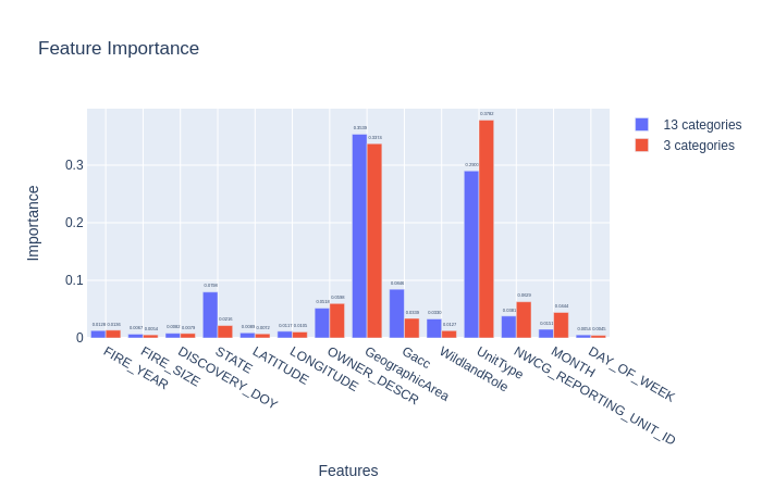
Further down are the correlations for each model in predicting 13 statistical causes and 3 types of statistical causes.
Correlations between predicted variables

- Correlations between prediction variables, this information is used for the random forest tree.
Feature Importance
Multinominal Logistic Regression
Random Forest
xgBoost
- svm kernel corrupted, restarting to grab images
Conclusion
We can predict wildfires with around 60% accuracy across the 13 statistical causes. If we reduce the number of classification categories to natural, human, and other causes we can achieve around 81% accuracy! Ultimately fires in the United States are having an upward trend and are seemily becoming more frequent in states like California, North Carolina, and Arizona.
